
Logotype
Our typographic signature uses custom letterforms inspired by the curves of fitness.
LOGOTYPE
Clear Space
To allow our logotype to stand out, do not place any objects such as graphics or text in the clear space shown.
LOGOTYPE
Minimum Sizes
120 PX
SCREENS
35 MM / 1.75 IN
The logotype should always be legible. Never use it at sizes smaller than specified.
LOGOTYPE
General Positioning
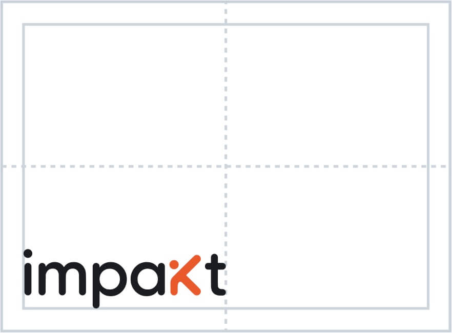
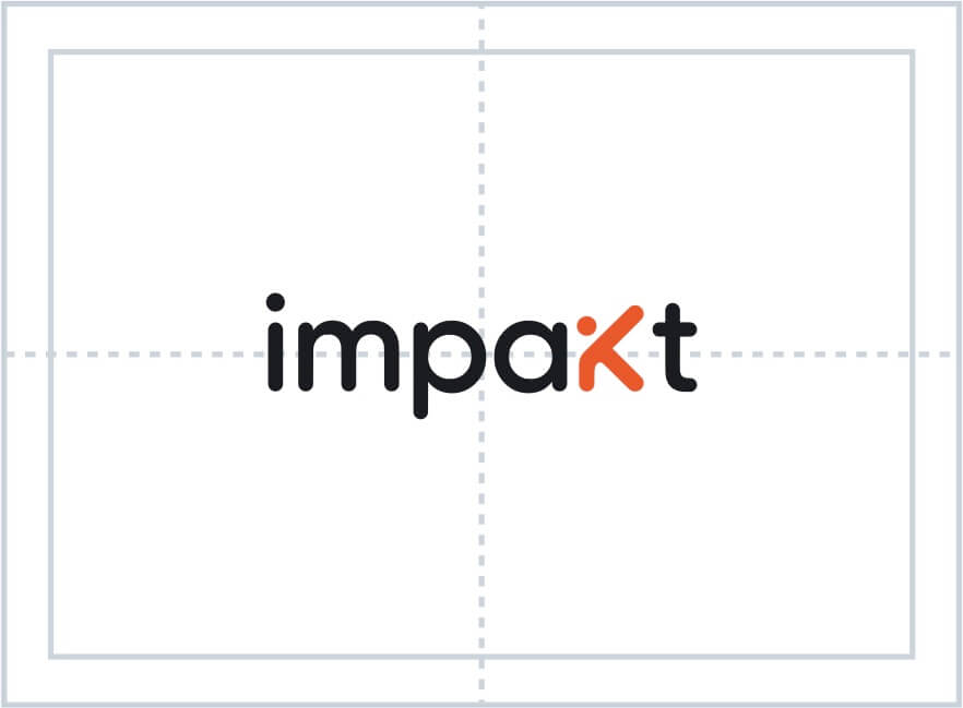
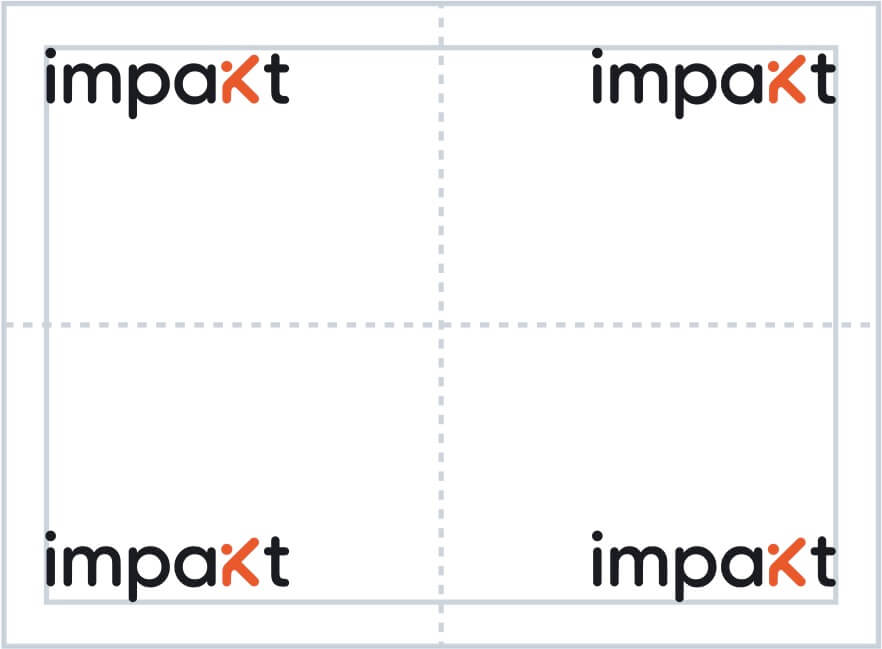
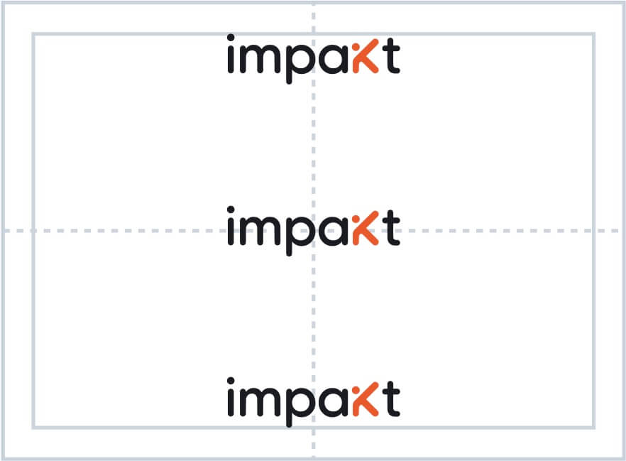
This general guidance applies to digital or print applications, including both portrait and landscape orientations.
When creating a composition, place the logo in one of the four corners, or center it on the central vertical axis. Take advantage of the space and make the logo as large as possible. Remember: Be bold, be proud, make it big!
Avoid using the logotype at sizes smaller than one-third of the canvas width.
LOGOTYPE
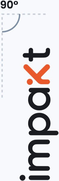
Rotation
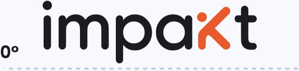
HORIZONTAL
VERTICAL
Typically, we place our logotype flat on a 0° angle. Horizontal is our default rotation state.
Occasionally, we rotate our logotype 90° to make the best use of space with unusual formats. By rotating the logo vertically, we are able to display it at a larger scale. Examples include vertical ad spaces such as "skyscraper" banner ads, physical banners/flags, and playful applications like merchandise or stationery.
LOGOTYPE
Please Don’t
Change the color of the logo.
Squash the logo.
Outline the logo.
Fill the logo with images.
Place the logo over a busy background.
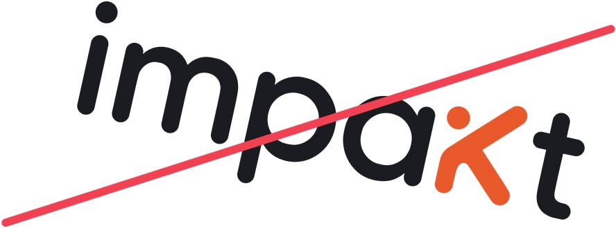
Skew the logo. Accepted rotations are 0° and 90°.
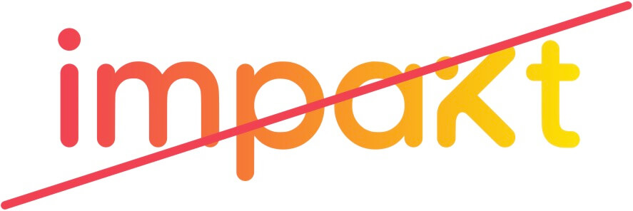
Fill the logo with gradients.
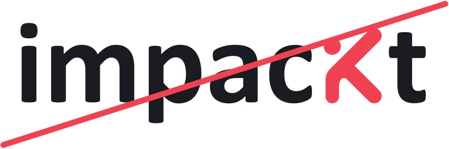
Recreate the logo using a different font.
Always use our logo properly. Here are some examples of what not to do with the Impakt logo.
Icon
Because Impakt's presence largely exists online, the consistent appearance of our icon is critical in ensuring our audience recognizes our brand across various spaces. In many cases, this symbol is the first introduction that people have to Impakt.
ICON
Avatars
Our icon is our face on social accounts, keeping Impakt's personality front and center. It can be safely used at a wide variety of sizes, as small as 16px like our favicon.
Core Brand Colors
FIRE
FITNESS
SURFACE
SLATE
The colors are as important to us as the logo itself. They’re part of the brand’s personality.
Core brand colors are the main colors of the brand identity so they have the strongest presence on Impakt brand.
BRAND COLORS
Secondary Colors
MAT
GOLD
SAFE
WATER
We use a range of bold, vibrant secondary colors to add splashes of delight to our UI and illustrations. Secondary colors may also be used for bold, full-bleed backgrounds.
BRAND COLORS
Neutral Colors
SLATE
SLATE II
OUTLINE
SURFACE II
SURFACE
PURE
Neutrals are used to provide utility and hierarchy without competing with our core and secondary colors.
Typography
Poppins is the typeface we use for headlines, when we want to shout out and get noticed. It's bespoke to Impakt, so no one else can use it. But let's make sure that we use it nicely!
TYPOGRAPHY
Usage
Headline
Track workouts.
Analyze performance.
Share progress.
Subtitle
Ready to get fit?
Do impakt now.
Paragraph
Lorem ipsum dolor sit amet, consectetur adipiscing elit, sed do eiusmod tempor incididunt ut labore et dolore magna aliqua. Ut enim ad minim veniam, quis nostrud exercitation ullamco laboris nisi ut aliquip ex ea commodo consequat. Duis aute irure dolor in reprehenderit in voluptate
We use Poppins for headlines longer than 10 words, subheadings, and all body copy.
Set leading to 140%. Exceptions can be made for large headings above 40pt in print applications and 40px onscreen. In these situations, you can reduce leading as the text size increases.
Set tracking to 0. Set kerning to 0, optical.
Never use below 14pt in print or 14px onscreen.
Type is usually left-aligned or centered. Never use fully justified.
Text should never be hyphenated.
Design
Glassmorphism
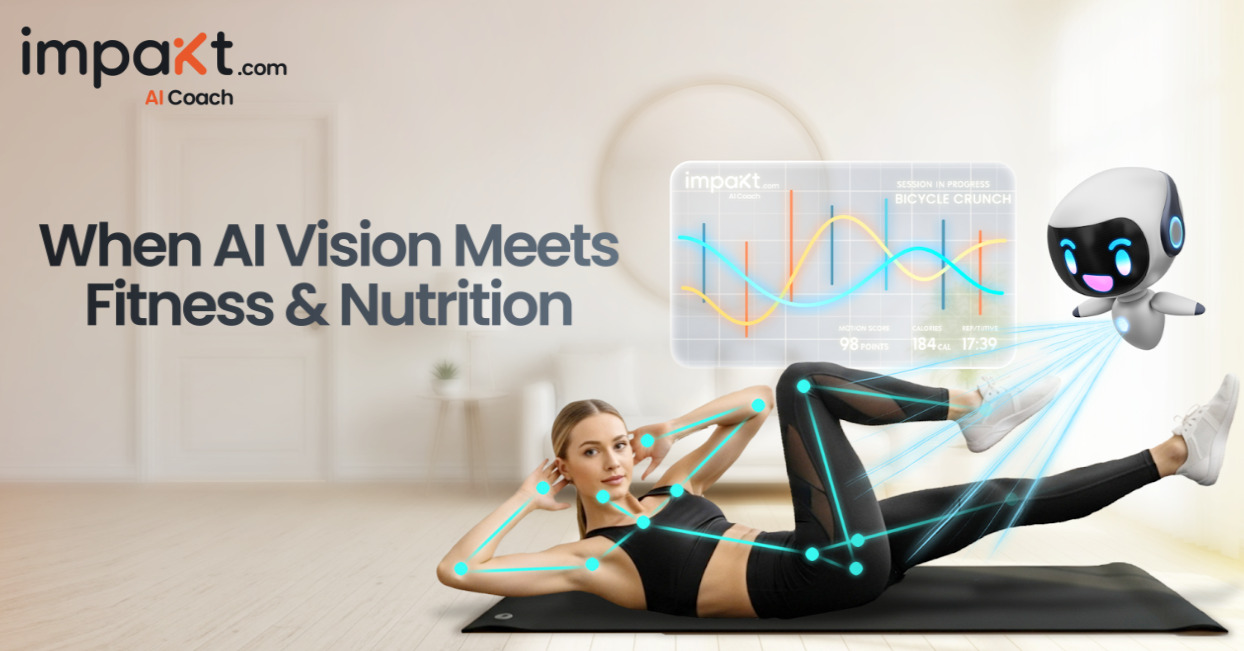
The First ever Fusion of AI, SocialFi, & Fitness
I'm your personal AI Coach, but you can call me Kaikai! I can automatically track and interact with you.
We love Glassmorphism design for its simplicity, warmth, and forward-thinking appeal, reflecting our brand's innovative mindset. It balances subtle transparency with adaptable flexibility, seamlessly enhancing any design.
Background: Soft light or dark with adjustable opacity for a clean, layered look. We recommend #FFFFFF08 for light and #00000040 for dark.
Borders: Rounded edges with a 1px solid border in #FFFFFF59, providing a polished and elegant finish.
Depth: Adjustable shadows and blur effects create a sense of depth and dimension. We recommend a blur radius of 16px to 32px and a spread radius of 2px to 4px for optimal results.
You AI coach, Kaikai always speaks with a rounded corner glass bubble with a sharp bottom corner in the direction of Kaikai.
IMAGERY
Photography
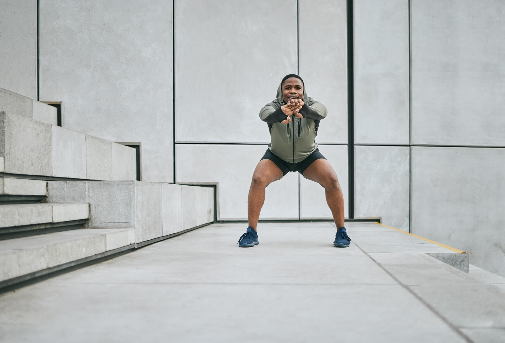
The photos we use reflect the kind of company we are, and the company we'd like to keep. We showcase authentic, real, interesting people with real-life stories to tell.
All our photography is led by people who use Impakt, revealing their stories and personalities.
A sense of place should be environments — the commute to work, ordering food on vacation, and activities with new friends.
Downloads
Download Impakt original brand assets.


